
Guides / Skew-T soundings
How to read a skew-T
A skew-T is a vertical slice of the atmosphere at one place and time. The red line is temperature, the green line is dew point, pressure falls as you go up, and the gap between the two lines shows how dry or moist each layer is. To read one, check the surface first, then the freezing level, then look for layers where temperature rises with height, then the CAPE and wind.
By Weather Decision Solutions. Published . Updated .
What a skew-T shows
A weather balloon rises through the air and measures temperature, humidity and wind at each level. A skew-T, formally a Skew T-log p diagram, plots that profile. Models can produce the same kind of diagram for any point and forecast hour, which is called a forecast sounding. The chart looks busy, but you only need a few lines to start.
The axes
- Vertical axis: pressure in millibars or hectopascals, from about 1000 at the bottom to 100 at the top. Pressure falls as you go up, so the bottom of the chart is the ground and the top is the upper atmosphere. 850 mb is roughly 5,000 feet up and 500 mb is roughly the middle of the atmosphere.
- Horizontal axis: temperature. The temperature lines are drawn at a 45 degree slant, running from the lower left up to the upper right, which is where the word "skew" comes from.
- Right edge: wind. Each level has a staff showing wind speed and direction at that pressure.
The temperature and dew point lines
Two profiles run up the chart. Many displays, including 4070’s, draw temperature in red and dew point in green. Temperature is how warm the air is at each level. Dew point is the temperature the air would have to cool to for water vapor to condense. The closer the two lines are, the closer that layer is to saturation. Where they sit wide apart, the air is dry.
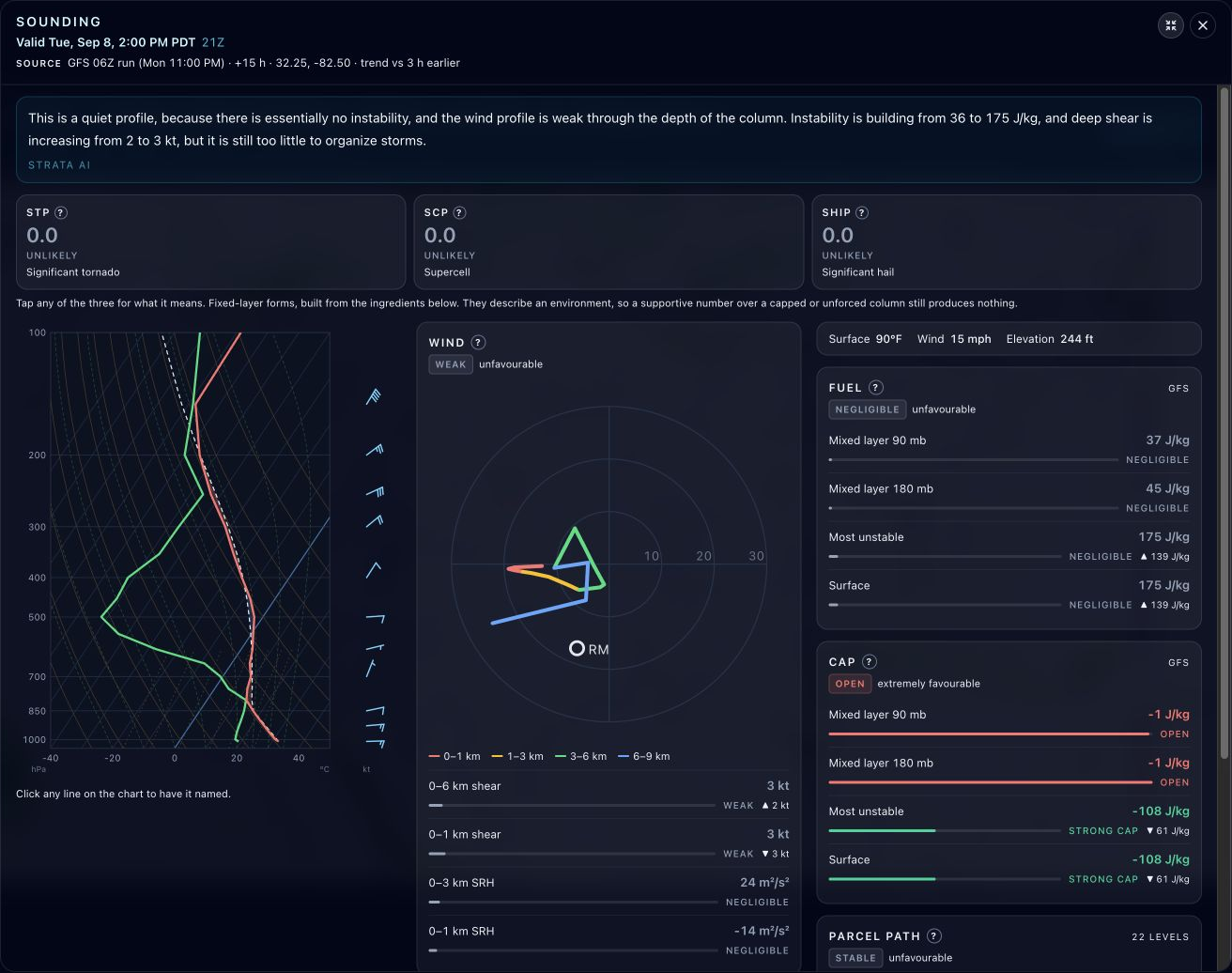
In that example the green line swings far to the left in the middle of the atmosphere. That is a dry layer. Near the ground the two lines run closer together, so the lowest layer is more moist.
Why layers matter: rising air
NOAA’s JetStream guide notes that dry air cools at about 9.8 degrees Celsius per kilometer as it rises, while saturated air cools more slowly, around 4 degrees near the surface, because condensation releases heat. The chart includes reference lines for both rates. What matters for reading: if a lifted bubble of air stays warmer than the air around it, it keeps rising, and that is the ingredient for thunderstorms. If it becomes cooler than its surroundings, it stops.
Winter: the freezing level and the warm nose
For winter weather, follow the red temperature line upward and find where it crosses the 0 degree Celsius line. Snow needs temperature at or below freezing from the cloud to the ground, with moist air through the layer. A sounding that stays below freezing the whole way down, with temperature and dew point close together, points to snow.
A warm nose is a layer where temperature rises above freezing between colder air above and colder air below. The red line bulges to the right of the 0 degree line before moving back left. NOAA’s JetStream samples describe it this way: snow falling into a warm nose melts, and if a shallow layer of freezing air sits near the ground it refreezes into ice pellets. When the cold layer is shallower or the warm nose is larger, rain can fall and freeze on contact with the surface, which is freezing rain. The size of the warm nose and of the cold layer below it, measured in the real chart, is the difference between snow, sleet and freezing rain.
| Type | Profile | What to check |
|---|---|---|
| Snow | Moist air and temperature below freezing from cloud to ground. | Surface temperature close to freezing makes a wet snow. |
| Ice pellets (sleet) | A warm nose aloft that melts the snow, then a cold layer near the ground that refreezes it. | How deep the cold layer at the bottom is. |
| Freezing rain | A warm nose, with a shallow cold layer or only a surface temperature at or below freezing. | Surface temperature at or below 32 F while air above is warm. |
| Rain | Temperature above freezing through the lowest layers. | Where the freezing level sits relative to the ground. |
Thunderstorms: CAPE and CIN
CAPE, convective available potential energy, is measured in joules per kilogram and describes how much energy is available to a rising bubble of air. Higher values mean more potential for strong updrafts. CIN, convective inhibition, is the negative side: NOAA’s Storm Prediction Center describes it as the negative area, often a capping inversion or warmer air aloft, that inhibits the release of that energy. A large CAPE with a strong cap can produce a clear afternoon and no storms. A large CAPE with a weak cap can produce a storm in a few hours. In the screenshot above there is almost no CAPE, so the profile is quiet whatever the cap does.
Wind matters too. Wind that changes speed and direction with height, called shear, helps storms organize. The hodograph in the middle of the screenshot is another way to draw that wind profile.
A step-by-step read
- Check the header: point, model, run and valid time. A sounding from a different hour is a different atmosphere.
- Read the bottom of the chart. What are the surface temperature and dew point?
- Compare the red and green lines up the column. Where they sit close together, the air is moist. Where they separate, it is dry.
- Find the freezing level, the height where the red line crosses 0 degrees Celsius.
- In winter, look for a warm nose between colder layers. Note how deep the cold layer at the bottom is.
- In convective weather, check CAPE and CIN, then the parcel path if one is drawn.
- Read the wind staffs and the hodograph. Strong wind that turns with height favors organized storms.
- Step through forecast hours. One sounding is a snapshot. The trend tells you more.
Soundings in 4070
Soundings in 4070 Pro open a skew-T, hodograph, severe storm ingredients and a plain-language read for supported GFS and HRRR maps, and keep your point pinned across forecast hours. In Model Explorer, choose a supported map, click a spot and open the sounding. Our HRRR and GFS pages say what each model is best at.
A forecast sounding is a model’s estimate, and small temperature errors near freezing can change the precipitation type. Official National Weather Service forecasts, watches and warnings remain the authority for what is expected where you live.
Common questions
How do you read a skew-T diagram?
Start at the bottom with the surface temperature and dew point, then follow the red temperature line and green dew point line upward. Where they are close, the air is moist, and where they separate it is dry. Find the freezing level, look for a warm nose in winter or CAPE in summer, and read the wind staffs.
What do the red and green lines on a skew-T mean?
In many displays, including 4070, the red line is temperature and the green line is dew point. The closer they are, the closer that layer of air is to saturation.
What is a warm nose on a sounding?
A warm nose is a layer aloft where temperature rises above freezing between colder air above and colder air below. Snow falling into it can melt, and depending on the cold layer near the ground it can refreeze into ice pellets or freeze on contact as freezing rain.
How can I tell snow from sleet on a skew-T?
Snow has temperature below freezing from the cloud to the ground. Sleet has a warm nose aloft that melts the snow and a deeper cold layer near the ground that refreezes it. Freezing rain has a shallow cold layer at the surface, or only a surface temperature at or below freezing.
What is CAPE and what is a high CAPE?
CAPE is convective available potential energy, measured in joules per kilogram, and it describes how much energy is available to a rising bubble of air. Higher values mean stronger updraft potential, but CIN, the cap, decides whether storms get started.
What is CIN on a sounding?
CIN, convective inhibition, is the negative area on a sounding, often from a capping inversion or warmer air aloft, that inhibits the release of CAPE. A strong cap can stop storms from forming even when CAPE is large.
Why is it called a skew-T log-p diagram?
The temperature lines are skewed at a 45 degree slant, and the vertical axis is the logarithm of pressure. Together they make a chart where the lines for rising air are easy to compare with the temperature profile.
Sources
- NOAA JetStream, Skew T-log p diagrams. How the temperature, dew point and wind staffs are drawn, and how dry and saturated air cool as they rise.
- NOAA JetStream, Sample skew-T soundings. Snow, ice pellet and freezing rain profiles, including the warm nose.
- NOAA SPC, CAPE and CIN notes. CAPE is convective available potential energy in J/kg; CIN is the negative area, often a capping inversion, that inhibits the release of that energy.
- NWS Springfield, Winter weather forecasting checklist. Forecasters use 850 mb temperature and thickness as guides for snow, and the technique is only as good as the model output.
- NOAA JetStream, 500 mb constant pressure chart. Heights are in decameters, so 564 means 5,640 meters; 500 mb is about the middle of the atmosphere; vorticity maxima help locate shortwave troughs.
Open a sounding at any point.
Soundings in 4070 Pro open a skew-T, hodograph and plain-language read for supported GFS and HRRR maps. Try it with seven days free.